- Skip to primary navigation
- Skip to secondary navigation
- Skip to main content
- Skip to primary sidebar
How Little Can We Use? Gatsby’s Set
 We often forget in all the beauty of the period that the story of Gatsby is in fact, a memory. It moves from place to place with that in mind and tends to bring events and people in and out of focus that way. That’s what we’re trying to highlight. We’re being told a story as one man remembers it.
One of the fascinating things about human memory is that some things are crystal clear and others are not. I can tell you the layout of rooms in every house I’ve ever lived in as a kid (seriously, every house, it’s a little scary) but what I really remember details of are my bedroom, where my mother hung her favorite painting, or the chair my dad loved. My image of what else was in the room is sketchy at best.
As always we did a bunch of research (“God that Movie is beautiful”, “Catherine Martin is a freeking genius” – She’s Baz Lhurmann’s designer and does pretty much everything – “Have you looked at these old mansion’s? They’re Amazing!”).
Scott came with some images of a ballet version that were lovely and clean while I went back to the architecture and spent a ridiculous but wonderful afternoon – ok, night, with a bottle of wine – looking at pictures of old Gold Coast mansions.
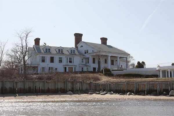
This place is a little broken down these day’s but it’s the one they believe Fitzgerald modeled Daisy’s house after.
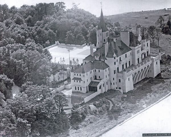
This place was demolished but it’s what was believed to be the house Fitzgerald used for Gatsby’s place. New and a little gaudy compared to the more traditional Buchanan house.
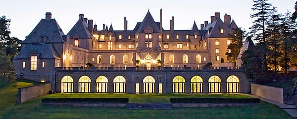
This is part of what they used in the recent Movie. If you’re interested in more there’s a great website that kept me going for HOURS. http://www.oldlongisland.com/
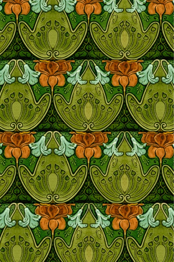
As is often the case I had my fill of architecture porn and then started to get real. One of the things that most draws me about this time period are the gorgeous patterns. It’s the end of Art Nouveau and the beginning of Art Deco and graphics really started to come into their own at this point.
Art Nouveau Wallpaper
Art Deco Wallpaper
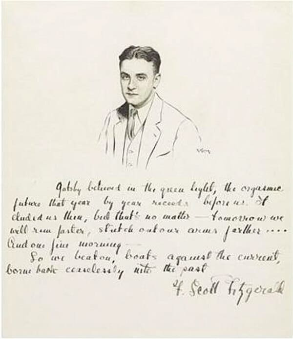
So with memory and pattern in my mind I decided to go back to Fitzgerald’s original text for more inspiration….and ended up literally wanting to use his text.
In contrast to what you probably just saw at the movies, Scott & I keep asking ourselves about how little we can use to communicate with you-all where we are when it’s important to know that. I like to ask the question “if you can only use one object to describe the location, what would that object be?”
We’ll use the film projector at the Venetian (Yeah Venetian!) to help us transition from place to place as well as some highly paired down 3D elements to give us a sense of “clean depth” that Scott was hankering for.
So, we’re hoping it’s very clean and beautiful. That we transition in a sort of lyric, almost musical fashion that gives us a sense of place without making it a show about a set and that we create moments of memory by highlighting an interesting object or two for each place.
We think it’s going to be lovely and magical but the truth is it’s always a bit of a crap shoot until it’s on stage and going. Up until that moment it’s just plans and dreams and one of the things I love most about working with Scott and B&B is that we take risks here…if we’re going to fail we fail valiantly and with glory. That’s a nice kind of art to make.
Or this whole concept is just an excuse to give Melissa Heller, the Costume Designer, all the hard work so I can hang out in the bar more…..
Megan Wilkerson
Scenic Designer
The Great Gatsby


Reader Interactions